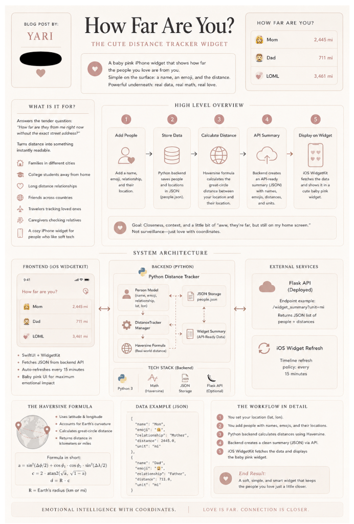
Blog post: Yari
It’s Tech Tuesdays Girlie Pop!
Date: July 21th, 2026
There are apps that track your steps. Apps that track your spending. Apps that track your sleep and then judge you like a tiny wellness accountant, I know I didn’t get my full eight hours, things happen.
But this project tracks something softer in life, your pookie:
How far you are from the people you love, right on your home screen.
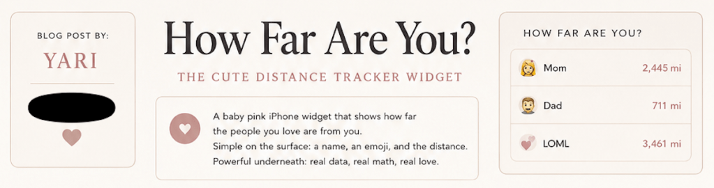
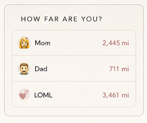
The How Far Are You? Distance Tracker is a small, baby pink widget that shows the distance between you and the people you add, like Mom, Dad, LOML (love of my life), your best friend, your sibling, your long distance partner, your dog (if your dog had a tracking app) without having to use the find my device function.
It’s simple on the surface: a name, an emoji, and the distance. But under that soft pink interface is a real technical workflow: location data, Python backend logic, Haversine distance math, JSON storage, an API ready summary, and an iOS WidgetKit front end because Apple does not accept Python coded widget add ons. It’s kind of like an emotional intelligence with coordinates, girlie pop! Just imagine a distance tracker on your home screen telling you how far baby cakes is, a total dream!
What The Widget Is For?
Well, a credit rating is an opinion about the likelihood that a borrower can meet its debt obligation. The widget answers a tiny but surprisingly tender question: How far are they from me right now without the exact street address?
Instead of opening a map, zooming out, checking pins, and realizing your family is scattered across time zones like a group chat with commitment issues, the widget turns distance into something instantly readable.
It’s not just utility. It’s for:
- → Families living in different cities
- → College students away from home
- → Long distance relationships
- → Friend groups spread across countries
- → Travelers tracking loved ones while moving
- → Caregivers checking relative distance
- → A cozy iPhone widget for people who like soft tech
It is basically Find My Friends, but gentler, cuter, and less I’m watching your every move with a ton of extra steps. The goal isn’t surveillance, but the closeness, context, and a little bit of aww, they’re far, but still on my home screen.
Think F1 Paddock Fashion, But Software Edition:
Credit ratings generally move from the strongest borrowers at the top to the weakest. The best way to understand this widget is to think about Formula 1 paddock fashion (stay with me, I’m working pop culture into this).
F1 isn’t just engines, tire strategies, and men in fireproof suits looking stressed in garages while a crew gets ready to change tires. It’s become a full visual ecosystem for the girlies (a social event); it has: race weekends, paddock walks, camera flashes, luxury, curated outfits, and the kind of fashion moments that make TikTok say: Wait, who is she? How is her posture so perfect?
I’m talking about Alexandra Leclerc, formerly Alexandra Saint Mleux, and she’s a total dream.
Alex has become part of that F1 style conversation just as much as the cars, often she covered for her polished paddock looks, Monaco adjacent elegance, and the way F1 fashion now travels across social media almost as fast as the cars. Formula 1 itself has described her as an art historian, influencer, and fashion figure, and fashion outlets have increasingly covered her race weekend style. In a way one could say that Alexandra has brought the female gaze to the FI, and garnered interests in the sport, as well as the revenue associated with woman entering the traditionally male space.
That is the energy this widget tries to borrow: beautiful presentation wrapped around technical performance.
- In F1, the car is engineering but the paddock is the storytelling.
- In this project, the Python backend is the engineering, but the widget is the paddock walk.
The code does the serious work: calculating distance, storing the distance between, preparing structured data. The interface makes it feel effortless and relatable; it’s the part you get to design however you want, it’s good product design. Not everything technical needs to look like it was assembled in a basement by a spreadsheet and lack of design. Sometimes the code can work hard while the interface gets to be cutesy.
The Backend Is Where Python Does The Math:
The backend is written in Python and handles the core logic. It’s important to mention that this is a very simplified widget project, it doesn’t consider the compliance for policy that goes alongside with producing an Apple coded Widget.
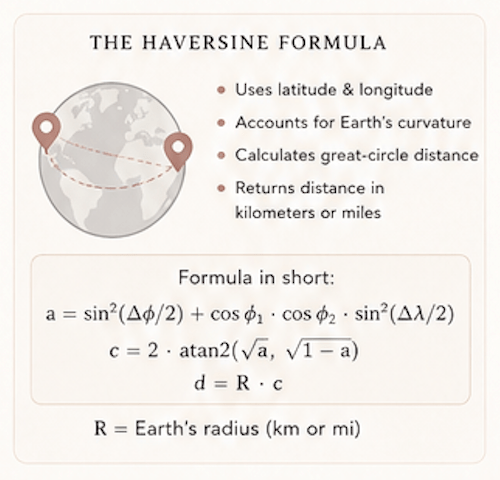
At the center is the Haversine formula. It calculates the distance between two points on Earth using latitude and longitude and the straight line distance between NYC and LA accounts for Earth’s curvature. The Python function takes on the following:
- Your latitude & longitude
- The other person’s latitude & longitude
- Measures the unit between in kilometers or miles
Then it calculates the great circle distance and returns the result rounded to two decimals. The file defines Earth’s radius in kilometers and miles, converts coordinates into radians, applies the Haversine formula and then returns the final distance.
This is what makes the widget accurate. It’s not just subtracting coordinates like a geometry project, it’s using actual geospatial math. The python coded backend defines a person into a model using a name, emoji, relationship, latitude, and longitude. That is the part that makes the app personal. You’re not tracking anonymous points on a map; it’s Mom or LOML, with a 🥰 emoji. That is the small difference- you’re building to connect, not to disappear.
The DistanceTracker Manager: The Tiny Relationship Database
The DistanceTracker is the manager behind the scenes. It stores your own location, the people you add, updates locations, removes people, and calculates the distance from you to each person. It starts with your latitude and longitude, then maintains a dictionary of people. It can set your location, add or update a person, remove someone, update a person’s coordinates, and calculate the distance to a selected person which is very practical software design since each method has a clear job.
set_my_location() says: here is where I am.add_person() says: here is someone I care about.update_person_location() says: their location changed.get_distance_to() says: how far are they?
The app saves the data locally into a JSON file called people.json, so the people you add can persist instead of disappearing every time the script ends. The _save() function writes the people data into JSON, and _load() brings it back when the tracker starts again. That local persistence is important as nobody wants to not see Mom every time the app reloads.
The Widget Summary: Turning Backend Logic Into UI Ready Data
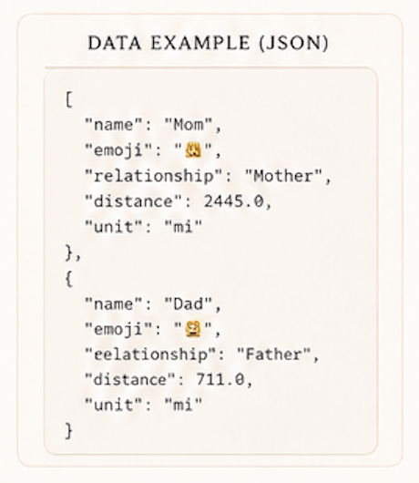
The backend includes a widget_summary() method, which returns a list of dictionaries ready for the front end. Each item includes:
- Name, Emoji, Relationship, Distance, Unit, and Error message (if needed)
Basically, the backend isn’t just doing math; it’s packaging the results for the interface. The Swift widget doesn’t need to understand all the geospatial logic. It only needs to receive clean, readable data. The widget_summary() method loops through the stored people, calculates the distance, and returns UI ready results. That is where the backend becomes product friendly and the code signals that it handled the heavy math, and is now working on the pretty vision next.
The Swift Widget: Baby Pink, But Make It Functional
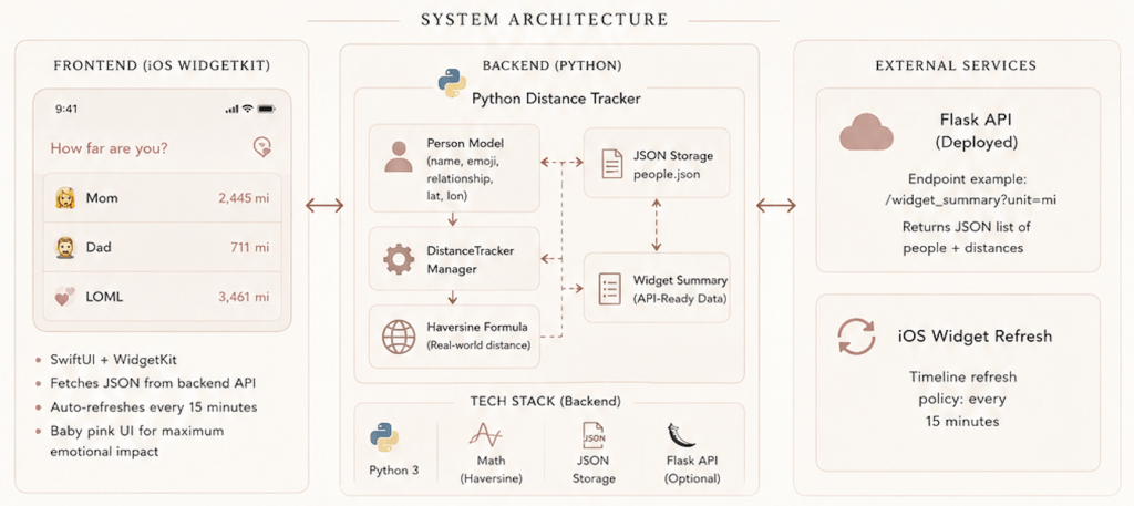
The backend includes a widget_summary() method, which returns a list of The Swift file that is the iOS widget layer, designed to be dropped into a WidgetKit Extension target in Xcode. The widget calls a backend API, for ex: a Flask endpoint, to get each person’s distance from you, then renders the result in a baby pink card (or whichever color you want to make the widget into).
The Swift code defines a Person structure that matches the backend summary: name, emoji, relationship, distance, and unit. The backend and front end need to speak the same language, much like you and your besties (It’s about being on the same wavelength.
- Python sends distance –> Swift expects the distance.
- Python sends emoji –> Swift needs to know what to do with it. Otherwise, the app becomes a couples therapy session between two programming languages where no one connects.
The widget provider fetches people from a backend URL, decodes the JSON, and refreshes the widget every 15 minutes. That refresh loop is because a widget isn’t a full app that you constantly open. It needs to update quietly in the background and show you the latest available information, quietly soft launching the data onto your home screen.
The design uses a baby pink palette (but you can change it into whatever you’d like), with background, card, accent, and text colors defined in Swift. The result is a widget that feels more like a lifestyle accessory than a geospatial computing project. It’s smart, useful, and cute enough to deserve a screenshot.
5 Step Code Pipeline
The Jupyter notebook in this article is the analytical engine. You’ll need to familiarize yourself with this when you apply to that quant job.
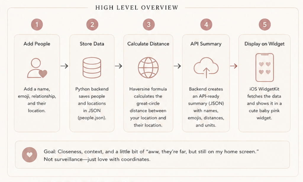
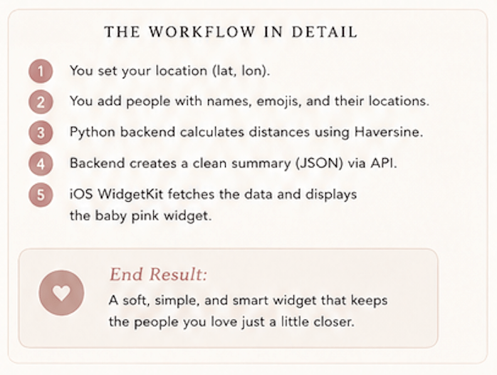
Step 1: Collect the Inputs
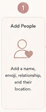
The user adds a person by name, emoji, relationship, and location coordinates.
Ex: Mom 🥰 Mother = Latitude and longitude
The who matters? step. Remember, the app isn’t starting with maps, it is starting with people (the data entry).
Step 2: Store the People
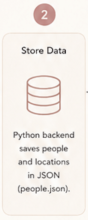
The Python backend stores each person in a dictionary and saves the data locally into people.json. The app remembers your people as data models even after it restarts. A good app remembers context, but a great app remembers Mom.
Step 3: Calculate the Distance
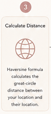
The backend uses the Haversine formula to calculate the real world distance between your location and the other person’s location. It’s the meaningful math step. The formula accounts for Earth’s curvature and returns distance in miles or kilometers. So, when the widget says LOML is 1,657 miles away, it’s not being dramatic.
Step 4: Package the Data for the Widget
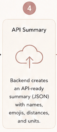
The backend creates a clean summary with each person’s name, emoji, relationship, distance, unit, and any error message. Raw coordinates enter; Human readable widget data exist.
Step 5: Display It on the iPhone Widget
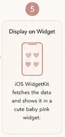
The Swift WidgetKit code fetches the summary from the backend API, decodes the JSON, and renders the distance cards in a baby pink interface.
Why It Works & What It Could Become
This project works because it combines three things:
- Technical usefulness
- Emotional relevance
- Aesthetic presentation
A lot of beginner apps are useful but boring. A lot of pretty apps are cute but technically shallow.
You, as a FinTech Girlie, will have projects that are both useful and technically savvy. The project has backend logic, real distance math, API ready structure, Swift widget integration, local persistence, and a user experience that feels personal. That’s what makes it portfolio worthy, it shows:
- Python backend development, Geospatial calculation
- Data modeling, JSON persistence
- API ready architecture, SwiftUI/WidgetKit UI design
- Frontend backend data alignment, Product thinking, Aesthetic branding
What It Could Become
The next version could turn this into a real app experience with future features like:
- Live CoreLocation integration, Flask API deployment
- App Group storage for iOS,Privacy controls
- Consent based location sharing, Favorite people
- Distance change alerts, Travel mode, Relationship groups
- Map preview, Widget themes, “Closest person today” insight
- Long distance countdowns
An Ethical Note: Location data is sensitive. This kind of app should be consent based, transparent, and private by default. Nobody should be tracked without knowing. The best version of this product is not surveillance; it’s the emotional context with permission. The difference between cute and creepy.