
Blog Post By: Yari
Date: 09/15/2026
The Financial Accounts of the United States sounds like a situationship with 300 pages of context and absolutely no intention of explaining itself. Who owes whom? Why did the balance change? Is everyone actually wealthier, or did their assets just get better lighting?
Fortunately, the Federal Reserve clarifies that. Its quarterly Z.1 release maps financial assets, liabilities, transactions, and selected balance sheets across the economy. The September 11, 2026 release incorporated private credit lending vehicles, private credit loans, and hedge funds. More of the financial guest list is visible, and the footnotes deserve your attention.
For analysts, product teams, and interview ready fintech girlies (like you and me), the useful skill is understanding what each number can explain. Because “wealth increased” and “people saved more” are two completely different sentences, and your spreadsheet should always reflect that correlation is not causation.
Think of the Z.1 as a financial closet organized by owner, item, and accounting view.
- A sector identifies whose finances you’re examining.
- An instrument identifies the claim: deposits, loans, bonds, or equities.
- A stock measures the balance at a moment in time.
Transactions capture activity during a period. Revaluations capture changes from repricing. Other changes can reflect adjustments to definitions or classifications.
Together, these concepts help explain why an ending balance differs from its starting point. The Fed documents these distinctions in its explanatory notes.
Imagine your investment account increased from $10,000 to $12,000. Perhaps you deposited $2,000, perhaps your investments appreciated by $2,000, or perhaps both happened.
Simply, the ending balance can’t identify the explanation by itself. That is the first rule of Z.1 fluency: a change in value is an observation. Explaining that change requires additional evidence.
Now give the headline some numbers.
The Pretty, the Ugly, the Math

FRED’s TNWBSHNO series measures net worth for households and nonprofit organizations. Keep that complete label: the population includes nonprofits. The observations are quarterly, measured at period end, expressed in millions of dollars, and not seasonally adjusted.
The September release reports $183,067,096 million USD for 2026 Q1 and $195,870,496 million USD for 2026 Q2.
Divide each figure by $1,000,000 to convert millions into trillions:
2026 Q1: $183.067096 trillion.
2026 Q2: $195.870496 trillion.
Subtract the earlier balance from the later balance:
$195.870496 trillion − $183.067096 trillion = $12.803400 trillion.
Then divide the increase by the starting balance and multiply by 100:
$12.803400 trillion ÷ $183.067096 trillion × 100 = 6.9938%.
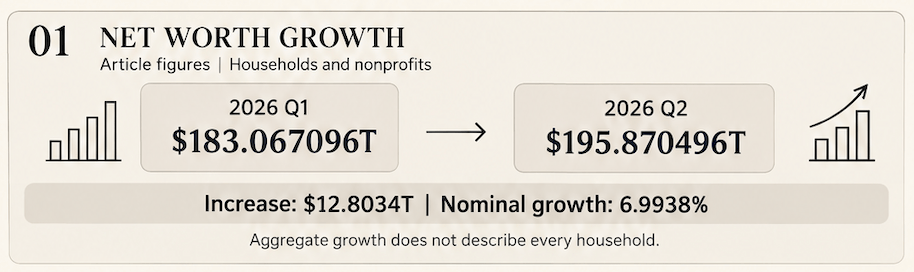
Reported aggregate net worth therefore increased approximately 6.99% between those quarter end observations.
That calculation doesn’t establish that every household became 6.99% wealthier, nor tell us that spendable cash increased proportionately. It doesn’t even identify saving as the driver.
An aggregate can arrive in couture while the typical household is still checking whether its direct deposit cleared.
To understand that, consider a synthetic portfolio. These figures are teaching assumptions, not Federal Reserve observations. The portfolio begins at $100 billion and ends at $110 billion. Investors make $3 billion in net purchases. A documented classification adjustment adds $1 billion to the measured portfolio.
The accounting relationship is:
Ending stock − Beginning stock = Net transactions + Revaluation + Other changes.
Substituting our assumptions gives:
110 − 100 = 3 + Revaluation + 1.
Revaluation therefore equals $6 billion.
Of the $10 billion increase, transactions explain 30%, revaluation explains 60%, and the classification adjustment explains 10%.
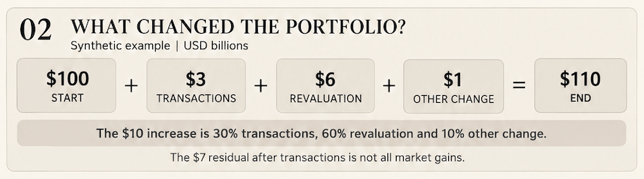
Now watch the mistake that survives a slide review. An analyst subtracts transactions from the stock change and labels the remainder “market gains.”
That produces $7 billion, overstating revaluation by $1 billion because the classification adjustment remains inside the residual.
An unexplained residual needs a label that admits it is unexplained. When other changes are
unknown, “revaluation plus other changes” is the defensible description.
Net worth adds another layer because it equals assets minus liabilities.
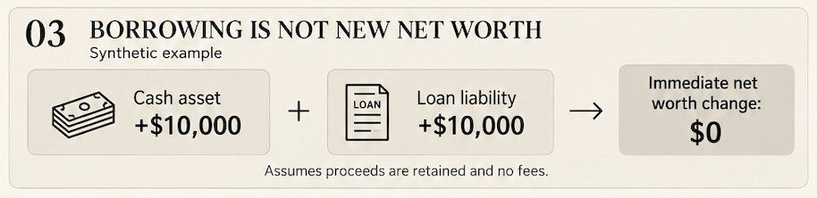
Moving money from deposits into shares changes the asset mix without automatically creating wealth. Borrowing $10,000 and keeping the proceeds adds an asset and an equal liability. At that moment, the two offset.
For a saving versus valuation explanation, examine the relevant changes-in-net-worth accounts and their definitions. The Fed provides a dedicated household and nonprofit view.
This is why “wealth increased” cannot carry an entire credit thesis in its handbag.
Liquidity deserves its own spotlight. A household can own an expensive apartment and still struggle to meet a payment due tomorrow.
Net worth measures a balance sheet cushion; liquidity concerns access to cash when obligations arrive.
For a hypothetical borrower, $500,000 of property equity and $500 in checking describe a very different payment situation from $50,000 in accessible deposits.
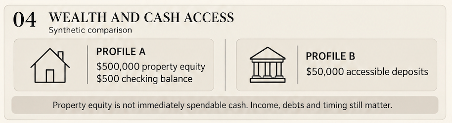
Neither profile can be judged responsibly without debts, income, timing, and other commitments. The example illustrates why a credit product should not translate an aggregate wealth gain directly into higher customer limits. Paper wealth cannot always make an entrance at the ATM.
The September release introduces another challenge: the measurement framework changed.
Private credit and hedge fund integration includes historical data beginning in 2012 Q4. The Fed also says the new hedge fund estimates use updated methods and classifications and are not directly comparable with the previous supplementary tables.
A new category appearing in the publication doesn’t mean the underlying activity suddenly began that quarter. Before joining old and new series, check definitions, coverage, and mappings. Where comparability remains unresolved, make that distinction visible. A continuous line can make a discontinuous definition look persuasive. Excellent eyeliner but questionable brand.
Analytical workflow:
Start the analytical workflow with one question: Did the latest net worth increase reflect accumulation, valuation effects, or measurement adjustments?
Use the Financial Accounts Guide to locate relevant series and inspect their construction. Record the series identifier, observation quarter, release date, retrieval date, units, seasonal treatment, and transformations beside your dataset. These details prevent specific mistakes. Units stop millions from becoming billions. Release dates distinguish updated history from the original estimate. Reporting conventions prevent an annualized flow from being subtracted directly from a quarterly stock change.
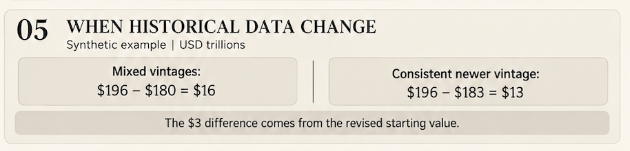
The metadata is part of the calculation. Revisions create a second practical test. Suppose an older release showed last quarter’s net worth at $180 trillion, while a newer release revises that same quarter to $183 trillion. If the current quarter is $196 trillion, mixing vintages produces a $16 trillion increase; comparing both quarters within the newer vintage produces $13 trillion. These invented figures illustrate how an apparent growth story can partly come from inconsistent inputs. Preserve the original file and compare versions deliberately. A revised estimate isn’t automatically evidence that the model failed. Your job is to separate changed source information from changed calculations and assumptions.
For ex: a lending team might see rising aggregate wealth and propose expanding credit limits. Before acting, it should ask whether its customers hold the appreciating assets, whether those assets are liquid, and whether monthly repayment capacity improved. The national number frames the investigation; customer evidence determines whether the proposal makes sense. That distinction connects macroeconomic analysis to product judgment without asking one statistic to do 5 separate jobs simultaneously. Python can make the arithmetic inspectable. A function named quarterly_bridge() could accept previous and current net worth, calculate the difference, convert units, and return the growth rate.
For the sourced observations above, its arithmetic should return:
Latest net worth: $195.870496 trillion.
Quarterly increase: $12.803400 trillion.
Quarterly growth: 6.993829%.
But a function containing only two balances cannot identify transactions or valuation effects. Those require additional inputs. A sophisticated function name doesn’t grant the code analytical powers it hasn’t earned.
Validation needs the same honesty. If you calculate revaluation as a residual and then check that this residual closes the identity, you have confirmed arithmetic consistency.
You haven’t independently established that the residual represents market gains.
A stronger check compares separately sourced components, investigates discrepancies, and documents any tolerance used to accept rounding differences. The model deserves scrutiny before it gets matching dashboard colors. Before publication, try to break the workflow deliberately.
Insert a duplicate quarter, remove a required value, reverse the observation order, or label a billion-dollar series as millions. Each test should trigger a specific response: reject the input, request correction, or prevent an unsupported result from appearing. Then check a known example by hand.
This validates behavior that matters to the analysis rather than merely confirming that the script runs. A green status badge should mean defined checks passed for identified inputs. It should never suggest that every economic interpretation is correct or that next quarter has agreed with your forecast.
Forecasting comes after the accounting is clear.
An educational comparison could evaluate three transparent candidates: the last observed level, that level plus the historical average quarterly change, and that level plus the historical median change. At each forecast date, use only earlier observations. Evaluate every candidate against the same later quarters.
Mean absolute error measures the average absolute difference between predictions and observed outcomes. Its interpretation still depends on the number of forecasts, the evaluation period, and the data vintage.
A backtest using today’s revised history is retrospective. Reconstructing an actual historical decision requires the information available at that decision date. Likewise, resampling a handful of quarterly changes cannot manufacture a rich history of financial crises. Eight observations in a trench coat are still eight observations.
A useful dashboard gives each chart a job: show net worth history, quarterly changes, independently supported decomposition, and forecast errors. Missing decomposition data should remain visibly missing. The dashboard doesn’t need to fill every card to deserve publication.
Imagine the interview question: “Household net worth rose sharply. How would you determine what happened and whether it changes your credit outlook?”
A strong interview answer sounds like this: “I would confirm the sector coverage, units, and release vintage, then calculate the quarterly change. Next, I’d examine the changes-in-net-worth accounts to distinguish accumulation, valuation effects, and other adjustments. I’d check whether revised classifications affect comparability. For a credit decision, I’d combine aggregate wealth with evidence on liquidity, debt service, and our actual borrower segment. Rising asset values alone don’t establish repayment capacity. If forecasting helps, I’d compare transparent baselines using time ordered evaluation and disclose whether the history is revised. I’d avoid assigning a driver the evidence cannot support.”
Using this article you should be able to write the stock change identity and assets minus liabilities. Explain the evidence each requires. Finish by connecting the result to the lending decision. Expect follow-ups about annualized flows, revisions, unexplained residuals, and why national totals might misrepresent a particular customer base. The useful response names the missing evidence and explains how it could change your conclusion.
The Z.1 rewards that discipline.
- Choose a sector
- identify the claim
- reconcile the movement
- preserve the release information.
- Ask whether the conclusion answers your original question.
That’s the simple fintech girlie standard: bring the chart, bring the calculations, and know which sentence the evidence has actually earned.
Code Pipeline:
The Z.1 pipeline turns financial observations into a dashboard with receipts. Based on the article and filenames, this is the intended breakdown; the uploaded scripts have not been inspected.
Extract: Collect the receipts
Start with household and nonprofit net-worth observations and their metadata: series identifier, quarter, units, and release date. Preserve the downloaded snapshot because historical estimates can be revised. Without that snapshot, yesterday’s analysis can change its story without explaining itself.
Validate: Check the guest list
Before calculating, check numeric types, missing quarters, duplicates, and chronological order. Confirm consistent units and reporting conventions. Mixing millions and billions gives the dashboard a financial glow-up nobody authorized. Invalid inputs should trigger an explicit correction or stop, rather than quietly becoming polished results.
Transform: Make the numbers work
Calculate quarterly change by subtracting the previous balance from the current balance. Divide that difference by the previous balance and multiply by 100 for percentage growth. Convert millions into trillions consistently. These calculations measure movement; explaining transactions, revaluation, and other adjustments requires additional evidence.
Analyze: Respect the evidence
A residual is not automatically a market gain. If transactions are subtracted from the stock change, unexplained adjustments may remain. Label that boundary. If forecasting is implemented, train on earlier observations and compare models against identical later quarters. A tiny sample cannot acquire economic wisdom through excellent branding.
Visualize: Dress the results
The charts and dashboard should consume shared calculated outputs. Display dates, units, sector coverage, and evidence labels. Separate reported observations, synthetic examples, and forecasts. Otherwise, readers may mistake a hypothetical scenario for an official statistic. The colors can coordinate; the evidence categories must stay distinguishable.
Publish: Keep the receipts attached
The HTML dashboard should remain traceable to saved inputs, calculations, and validation results. Exported tables make headline metrics inspectable. Test failure cases before publishing: missing data, inconsistent units, and unsupported decompositions should not become confident charts.
A completed dashboard proves that something rendered.
Reviewing the code and outputs establishes whether the pipeline behaves as intended.
Fintech Girlies Guide to Interview
So the chart got you into the room. Now someone across the table wants to know whether your explanation survives a follow-up on Superday.

Q: Net worth increased by 6.99%. Does that make you more bullish on consumer spending?
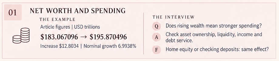
Strong answer: It is a useful signal, but I would examine who holds the appreciating assets, whether the gains are liquid, and whether income and debt-service capacity improved. Aggregate wealth growth alone does not establish stronger spending across all consumers.
Follow up: Would rising home values and rising checking account balances have the same spending implications?
Q: A portfolio rises from $100 billion to $110 billion, with $3 billion in net purchases. Were investment gains $7 billion?
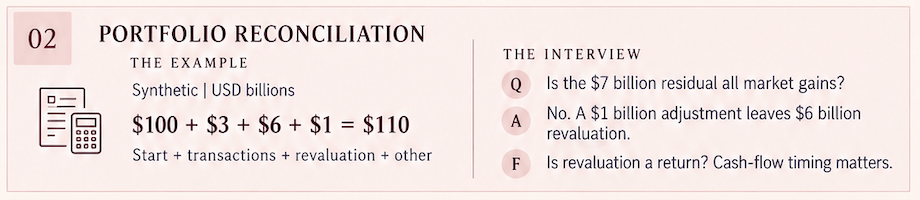
Strong answer: Only if other changes are zero. With a $1 billion classification adjustment, revaluation is $6 billion: $10 billion minus $3 billion minus $1 billion. Without adjustment data, I would label the $7 billion as revaluation plus other changes.
Follow up: Is the $6 billion revaluation equivalent to a 6% investment return?
Your edge: Not necessarily. Return measurement also depends on cash flow timing and the method used.
Q: A household borrows $10,000 and holds the proceeds in cash. What changes?
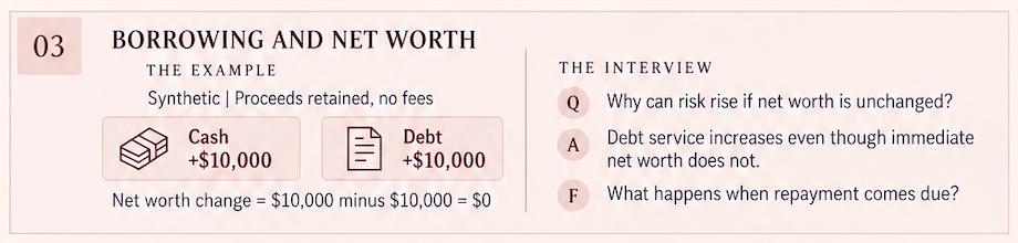
Strong answer: Assets and liabilities each increase by $10,000, leaving immediate net worth unchanged, assuming no fees. Cash availability improves, but debt obligations increase.
Follow-up: Why could unchanged net worth still conceal higher financial risk?
Q: Which borrower is safer: someone with $500,000 in property equity or $50,000 in accessible deposits?

Strong answer: Those figures alone are insufficient. I would assess income, debt service, existing liens, payment timing, and the loan structure. Property equity may support collateral recovery, while accessible deposits can support near-term payments.
Follow up: How would your answer differ for a mortgage versus an unsecured credit line?
Q: Your calculated wealth increase falls from $16 trillion to $13 trillion after a data refresh. Is the model broken?
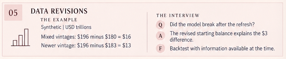
Strong answer: First, I would compare input vintages. Revising the starting balance from $180 trillion to $183 trillion, with the ending balance unchanged at $196 trillion, explains the difference. I would separate source revisions from calculation changes.
Follow up: Which vintage belongs in a historical backtest?
Your edge: Use information available at each forecast date when evaluating historical decision performance.
Q: Your forecast beats the baseline. Why shouldn’t we deploy it immediately?
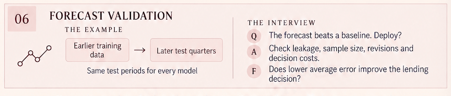
Strong answer: I would inspect the evaluation period, sample size, data leakage, revision effects, and performance across different conditions. Then I would connect forecast errors to the business decision and its costs.
Follow up: Does lower average error necessarily produce a better lending decision?
The Wall Street standard: know the number, explain it, and identify what would change your mind.
 The Yariverse