
Blog Post By: Yari
Date: 10/06/2026
An AI agent saying done without showing what happened is basically the software equivalent of I definitely texted you back…. But like which number? What time? Backlog a.k.a the receipts?
For an agent, the backlog (receipts) needs to connect the user’s request to the model calls, retrieval steps, tool executions, and outcome. Otherwise, the system worked might mean the API returned a response while the user received something useless. Excellent delivery, but wrong address.
Agent observability helps us investigate that gap, as tech girlies, we must get into the habit of proper due diligence.
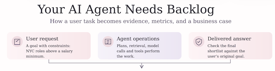
This tutorial uses the actual Python functions of the code linked to this article (found in the bottom of article) to inspect synthetic traces, calculate reliability, follow a simulated rollout, and explore the economics of fewer incidents. The useful skill is knowing what each output establishes before it acquires a dashboard and a budget request.
Think of a trace as the backlog or a receipt for one user task. A span records one operation within that trace. Span identifiers and parent links connect the work; attributes describe it. OpenTelemetry documents these relationships and how context follows requests across services.

Example 1:
The vocabulary is: plan, retrieve, model_call, tool_call, and approve. Which are the notebook’s illustrative labels.
A row named approve doesn’t mean a human reviewed anything, just like naming a folder “final_final” doesn’t settle the matter.
Imagine a career agent asked to find NYC roles above a salary threshold. It returns a shortlist quickly, but one role falls below the minimum. The tool may have returned successfully. The user’s constraint still failed. This is a hypothetical product example, separate from the notebook’s generated data, and it explains why operational status and answer quality need different evidence.
The notebook you’ll use (provided in the link) gives us a way to practice the operational analysis. It doesn’t run that career agent, evaluate its answers, or connect to a live telemetry backend. Its numbers are teaching data, while the questions remain valid.
The Pretty, the Ugly, & the Math
We can’t all look into a mirror and say we’re good at math to feel better, like Dakota (I’m a fan). In tech we have to prove it literally when it comes to anything involving NLP, transformers and agents.
Start with generate_trace_fixture(). With seed 42, it creates 12 synthetic traces containing 65 spans. Each trace receives between three and seven spans, with names sampled from the five labels above. Every generated span has a duration, status, model label, and illustrative cost. The configured 6% error probability applies to individual spans; it is not a promised 6% failure rate for whole tasks.

That distinction is important as trace_quality() marks a trace as failed if any of its spans has status error. In this batch, two spans report errors, and they belong to two different traces. Ten traces therefore pass the notebook’s rule.
The arithmetic simple:
Successful traces: 10 ÷ 12 × 100 = 83.33%.
Failed traces: 2 ÷ 12 × 100 = 16.66%.
Failed spans: 2 ÷ 65 × 100 = 3.07%.
All three numbers are correct, but all answer different questions. Reporting the span failure rate as the task failure rate would give the system a reliability makeover it didn’t earn. Which is bad.
The model assumes a 97% success target, leaving an allowed failure rate of 3%. It divides the observed trace failure rate by that allowance:
Failure rate relative to allowance: 16.6667% ÷ 3% = 5.5556 times.
Displayed error_budget_burn_pct: 5.5556 × 100 = 555.5556%.
The notebook returns BUDGET_EXCEEDED. This ratio says the batch’s failure rate is about 5.56 times the assumed allowance. It doesn’t mean 555% of requests failed. Or that a 12-trace teaching batch established how much of a real monthly error budget has been consumed. A production claim needs a defined service, measurement window, eligible population, and treatment of missing or sampled requests. This is why benchmarks are highly important when deploying AI Agents.
The failure definition needs scrutiny. If a tool call fails, retries, and ultimately completes the task, this function still marks the trace as failed. A trace with every status marked ok, will deliver a poor answer. Before using this rule as a product metric, you’re the deployer should decide whether you’re measuring internal errors, final task completion, or user satisfaction. The code can’t choose the business definition just because it brought parentheses. Next, group spans by operation name. The actual rollup is:
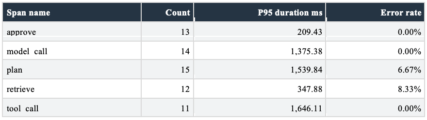
Synthetic fixture output from trace_quality(). Durations rounded to two decimals.
Tool calls have the highest p95 duration in this fixture, about 1,646 milliseconds, so this will happen is a relatively short about time. Retrieval has the highest observed error rate, 8.33%, but that’s one error among only 12 retrieval spans. Planning also has one error, among 15 spans. A higher percentage here, is a prompt to inspect the records, not evidence that retrieval is inherently less reliable.
P95 describes the upper part of a duration distribution. The notebook uses NumPy’s percentile calculation, which can interpolate between observations. With groups this small, one slow span can materially move the result. You should also resist adding those five p95 values to claim an end-to-end p95: percentiles do not combine that way, and real operations may overlap.
There’s another catch hiding in the word complete. All seven required fields are populated in 100% of rows. That confirms nonmissing values for those fields. It doesn’t verify whether the values are sensible, parent links form a valid graph, or approvals actually occurred. A fully completed form can still be fiction in a blazer.
For unusual durations, trace_quality() calculates a median absolute deviation score. It subtracts the overall duration median, takes the absolute difference, and divides by 1.4826 times the median absolute deviation. Scores above 3.5 are flagged; this fixture produces two flags. The calculation pools all operation types. A slow model call and a slow approval step should eventually be compared with their own relevant baselines before anyone assigns blame.
Analytical Workflow
Begin with a decision: which operation should we investigate, and what evidence would justify a change? The latency table suggests inspecting tool calls; the error table points toward retrieval and planning. Those are different investigations. A single red ranking cannot responsibly combine them without defining the cost of each failure.
For a real implementation, preserve task context across services, record consistent operation names, and distinguish attempts from final outcomes. OpenTelemetry’s GenAI repository provides conventions relevant to generative AI instrumentation. Check the applicable convention and version when implementing; the notebook’s simplified columns are not a complete implementation of that specification.
An instrumentation design should also decide which data is permitted to leave the application. My starting recommendation is an allowlist of operational attributes, with sensitive content removed before export and access limited by role. The supplied notebook generates no raw prompts and implements no redaction function. Safe synthetic inputs are useful for teaching, but they don’t demonstrate that a live logging pipeline can protect customer information.

The daily model is a separate experiment from the 12 trace fixture. simulate_daily_metrics() generates 90 days around an expected volume of 4,200 traces per day. It blends an assumed 8.5% error rate toward 2.8%, and an assumed p95 latency of 2,100 milliseconds toward 1,150 milliseconds. Day index 55 is the transition midpoint and the start of the post_rollout flag. Because the blend is smooth, the modeled change begins before that flag switches.
Those inputs imply a 5.7 percentage point reduction in the error rate level, or about 67.06% relative to 8.5%. They also imply a 950 millisecond, roughly 45.24% latency reduction. These are comparisons between assumed regime levels, not measured benefits from installing observability.
The distinction is the entire plot. The simulator was instructed to improve. A downward line cannot independently prove that the rollout caused improvement when improvement was written into its source code. Your hypothesis has arrived wearing its own recommendation letter.

The generated series has an average daily error rate of about 6.4044%. A fitted straight line over the post rollout subset has slope -0.000592463 in rate units per day, equivalent to -0.0592463 percentage points per day. That slope summarizes this simulated window. It is neither a permanent trend nor a forecast of how far errors can fall.
To smooth the series, ewma_control_chart() uses an exponentially weighted moving average with span 10. Its smoothing weight is 2 ÷ 11, about 0.1818. Recent observations receive more weight than older ones. The function then measures residuals around that moving average, calculates their rolling standard deviation over ten observations, and places bands three residual standard deviations above and below the average.
That is an inspectable diagnostic, but the implementation isn’t a textbook EWMA chart calibrated against a fixed, in control baseline. Its moving center can adapt to a sustained problem. Its early standard deviations are backfilled from later values, and today’s value helps construct today’s band. Treat these bands as exploratory anomaly indicators; a live alerting design needs calibration, historical only calculations, and an explicit false alarm policy.
Monitoring should connect to an owner and a response. A latency alert might trigger inspection of retries and external tools. A failed salary constraint should trigger evaluation of retrieval and ranking behavior. Governance guidance such as NIST’s AI Risk Management Framework can inform the broader review, but a reference to the framework is not a certification of this notebook.
When the Backlog Becomes a Budget Request
Here’s where the tech girlie opens the finance tab.
Incident_cost_model() connects failed traces to expected incidents through an editable 2% escalation assumption. Each expected incident carries an assumed $3,200 cost. After rollout, the model also values six debugging hours saved per incident at $95 per hour.
Use the steady regime assumptions for a hand calculation. At 4,200 daily traces and an 8.5% error rate, expected failed traces equal 357. Multiply by 2% and you obtain 7.14 expected incidents per day. Multiply again by $3,200 and modeled daily incident cost is $22,848.
At the assumed 2.8% error rate, the same volume produces 117.6 expected failed traces, 2.352 expected incidents, and $7,526.40 in daily incident cost. The difference is $15,321.60 per day. Fractional incidents represent an expectation across repeated exposure, not a claim that someone opened 0.352 of a support ticket.
Post rollout debugging savings at those assumptions equal 2.352 × 6 × $95 = $1,340.64 per day. This hand calculation holds volume and error levels fixed. The notebook’s financial schedule instead uses its noisy daily simulation grouped into calendar months, so this example isn’t a reconstruction of every monthly cash flow.

observability_roi() starts with a $40,000 engineering outlay, subtracts $4,500 in monthly tooling costs, and discounts cash flows over 18 months. It converts the assumed 12% effective annual discount rate to about 0.9489% per month. The saved output, reproduced from the supplied analytical functions with the September 18, 2026 date anchor, is an NPV of $1,818,472.23 and discounted breakeven in month 4.
Before that number gets a corner office, inspect how it was made. The simulated dates run from June 20 through September 17. The first monthly baseline covers only 11 days; later groups cover 31, 31, and 17 days. These are unequal exposure periods. The function compares their total incident costs without normalizing days or traffic.
It also floors negative avoided incident savings at zero, so incident deterioration does not create a negative savings term. After the available monthly groups end, it repeats the final group’s result through month 18. That produces $135,930.40 in modeled net cash flow in month 4 and every later modeled month. These are consequential modeling choices, not incidental formatting.
The first two monthly cash flows are -$4,500 each. Month 3 contributes $28,850.74 before discounting. Cumulative present value is still -$20,828.69 after month 3, then rises to $110,062.54 after month 4. That is how the reported breakeven occurs. The arithmetic closes; the business case still needs work.
A decision ready version should compare equal exposure periods, retain downside outcomes, and justify the persistence of benefits. It should also reconcile incident costs and debugging savings: the $3,200 assumption already includes engineering time, so separately adding saved hours requires checking for overlap. Released engineering capacity isn’t automatically a reduction in cash spending. Several failed traces may also belong to one incident, making the escalation assumption especially important.
On the seller side, pricing_tiers() models illustrative usage revenue. At 20 million spans per month, the assumed $180 price per million receives a 0.85 multiplier: $180 × 0.85 = $153, then $153 × 20 = $3,060 per month. The function applies the qualifying multiplier to all volume; it doesn’t calculate marginal pricing blocks.
The other modeled monthly revenues are $180 at one million spans, $900 at five million, $10,080 at 80 million, and $29,700 at 300 million. These are invented pricing scenarios, not vendor quotes or evidence of willingness to pay. Revenue still needs to cover infrastructure, support, acquisition, and everything else that politely arrives after the pitch deck.
Code Pipeline
Unlike other companies StipExtract and Define the Receipts
The notebook writes documentation references to source_data.csv and teaching inputs to model_assumptions.csv. It generates its own span table with generate_trace_fixture(); it doesn’t ingest JSONL events from a running agent. The dated simulation is generated separately. Keeping those two datasets distinct prevents the small fixture’s success rate from being mistaken for the 90 day model’s performance.

Validate the Guest List
TraceFixtureConfig.validate() rejects zero traces, invalid span ranges, and probabilities outside zero to one. validate_inputs() exercises eight checks, including duplicate detection, missing durations, seed reproducibility, and selected invalid arguments. All eight return True in the saved run. The duplicate and missing-value checks demonstrate detection in deliberately altered dataframes; they do not add automatic rejection to trace_quality().
A PASS label therefore means these named checks passed. It does not establish prompt safety, correct parent graphs, accurate user answers, causal improvement, or financially sound assumptions. The notebook also accepts rollout_day equal to n_days, even though later code indexes that day and expects a post-rollout subset. Boundary testing needs to cover the whole pipeline, not just the function that smiled first.
Transform the Numbers
This excerpt is the actual span aggregation used inside trace_quality(), not a replacement model:
rollup = spans.groupby(“name”).agg(
count=(“span_id”, “count”),
p95_latency_ms=(“duration_ms”,
lambda s: np.percentile(s, 95)),
error_rate=(“status”,
lambda s: (s == “error”).mean()),
).reset_index()
The count is the number of spans in each group. P95 uses duration_ms. The error rate is the fraction with status exactly equal to error. Downstream, the function groups by trace_id to apply its any error failure rule and calculate the 83.33% trace success result. Read the grouping keys before you read the headline.
Analyze the Time and the Money
simulate_daily_metrics() builds the rollout scenario; ewma_control_chart() adds smoothing and diagnostic bands. incident_cost_model() prices expected incidents, observability_roi() builds the discounted schedule, and pricing_tiers() calculates usage revenue. Each function has a specific job. None establishes that telemetry itself caused the assumed reliability improvement.
Tech Girlies Guide to Interview
So, the pretty (& super useful) dashboard got you to the next step, the big interview. Congrats! The work doesn’t stop there, the next round is technical, now someone wants to know whether you can explain why it’s green while the customer is a bit unearthed.
Q: The Agent Returned Successfully but the User Says It Failed
Strong 60 second answer: “I would separate transport success from task success and define the user’s acceptance criteria first. Then I would follow the trace through retrieval, model calls, tools, retries, and the final response. I would check whether the relevant constraint reached each step and whether our evaluation tests the delivered result. The notebook’s any-span-error rule measures one operational failure definition; it can flag a recovered retry and miss an incorrect answer with clean statuses. I would track internal errors and final task outcomes separately, identify the responsible component, and validate the fix against known cases. A successful response code alone cannot establish that the agent completed the user’s goal.”
Whiteboard path: write the user constraint, sketch the relevant operations, mark where the constraint is checked, and attach the final acceptance test. Show where a recovered error differs from a failed task.
Follow up: How would you evaluate an answer when no single deterministic answer exists? Your edge: define a rubric, use representative labeled cases, assess evaluator consistency, and review high impact disagreements. Do not claim the current notebook implements that evaluation.
Q: Why Are Failures 3.08 Percent in One Table and 16.67 Percent in Another
Strong answer: “The denominators differ. Two of 65 spans fail, while two of 12 traces contain an error. The notebook treats any error within a trace as a trace failure. I would label both metrics and confirm which one matches the product’s reliability objective.”
Follow up: What happens after a successful retry? Your edge: this implementation still fails the trace. A task-completion metric may need a different rule.
Q: Does 555.56 Percent Mean the Monthly Error Budget Is Gone
Strong answer: “It is the observed batch failure rate divided by the assumed 3% allowance, expressed as a percentage. It is a 5.56 times rate ratio. I would need the SLO window, request population, and remaining allowance before making a monthly budget statement.”
Follow up: How much confidence would you place in 12 traces? Your edge: enough to explain the calculation, not enough to establish stable production reliability.
Q: The Error Rate Fell After Rollout so Did Observability Work
Strong answer: “The simulation was explicitly configured to improve, so the chart cannot prove effectiveness. In a real rollout I would examine traffic mix, model and tool changes, rollout assignment, and comparable exposure. Instrumentation helps locate problems; measured fixes and a defensible comparison establish benefits.”
Follow up: Would an EWMA alert prove causation? Your edge: no. An anomaly indicator and a causal explanation require different evidence.
Q: Would You Approve the Project Based on the 1 Point 82 Million Dollar NPV
Strong answer: “I would first normalize the partial months, include deterioration, justify the final month extrapolation, and reconcile incident costs with debugging savings. Then I would test sensitivity to escalation probability and the persistence of benefits. The current output is a reproducible scenario result, not an approved return forecast.”
Follow up: Which assumption would you investigate first? Your edge: the mapping from failed traces to distinct incidents, because it scales the financial benefit and may count related failures repeatedly.
Q: Everything Passed Validation so Is It Ready to Deploy
Strong answer: “Eight defined checks passed. I would still need ingestion validation, graph and timestamp checks, privacy controls, representative task evaluations, alert calibration, and an operational response plan. I would also package the missing shared dependency and freeze the date anchor for reproducibility.”
Follow up: Does 100% field completeness prove valid telemetry? Your edge: it proves populated fields under this check. It doesn’t prove truthful values or correct relationships.
The Yariverse standard is simple: bring the trace, explain the denominator, and know which sentence the evidence has earned. Your agent can say done, but your analysis should be able to say what that means.
References
OpenTelemetry traces overview. 2026. Trace structure, spans, attributes, and context propagation. https://opentelemetry.io/docs/concepts/signals/traces/
OpenTelemetry GenAI semantic conventions repository. 2026. Implementation reference for generative AI telemetry conventions. https://github.com/open-telemetry/semantic-conventions-genai
NIST AI Risk Management Framework. 2026. Broader reference for managing AI risks. https://www.nist.gov/itl/ai-risk-management-framework
Numerical source: pipeline.ipynb. 2026. Telemetry and financial results are illustrative. The analytical functions were rerun; the external dashboard and receipt helpers were unavailable.